
AirHop
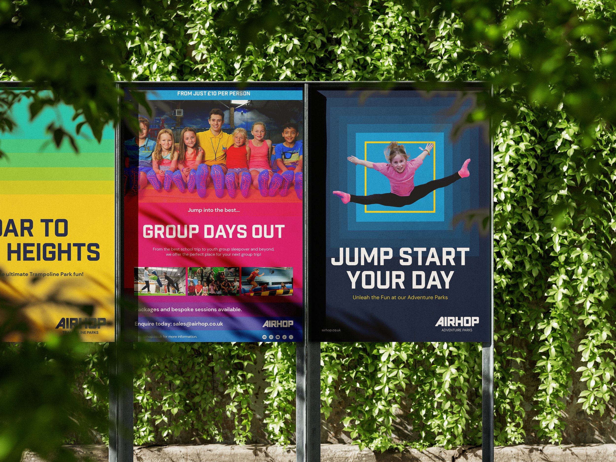
A new brand for an adventure park favourite, brought to life across 27 parks.
Services: Brand strategy, Brand identity / Sector: Destination
Background
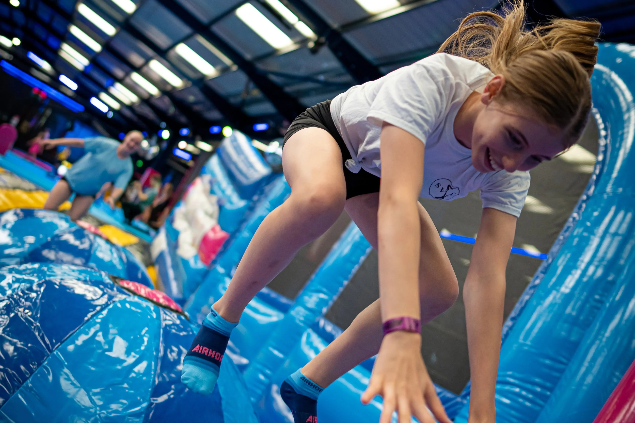
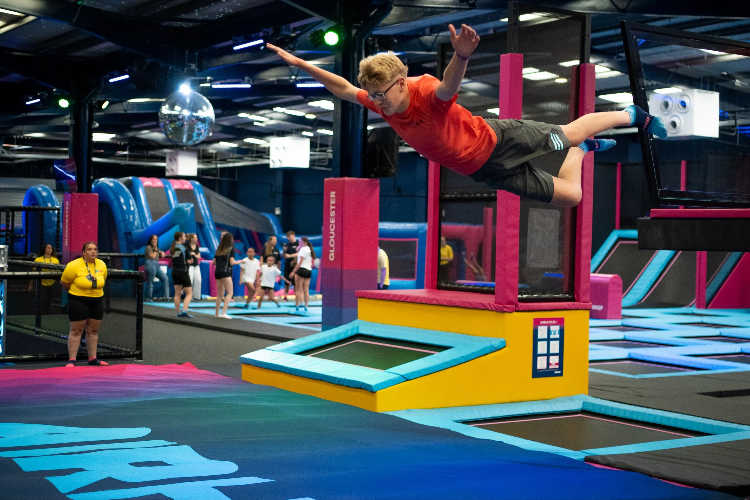
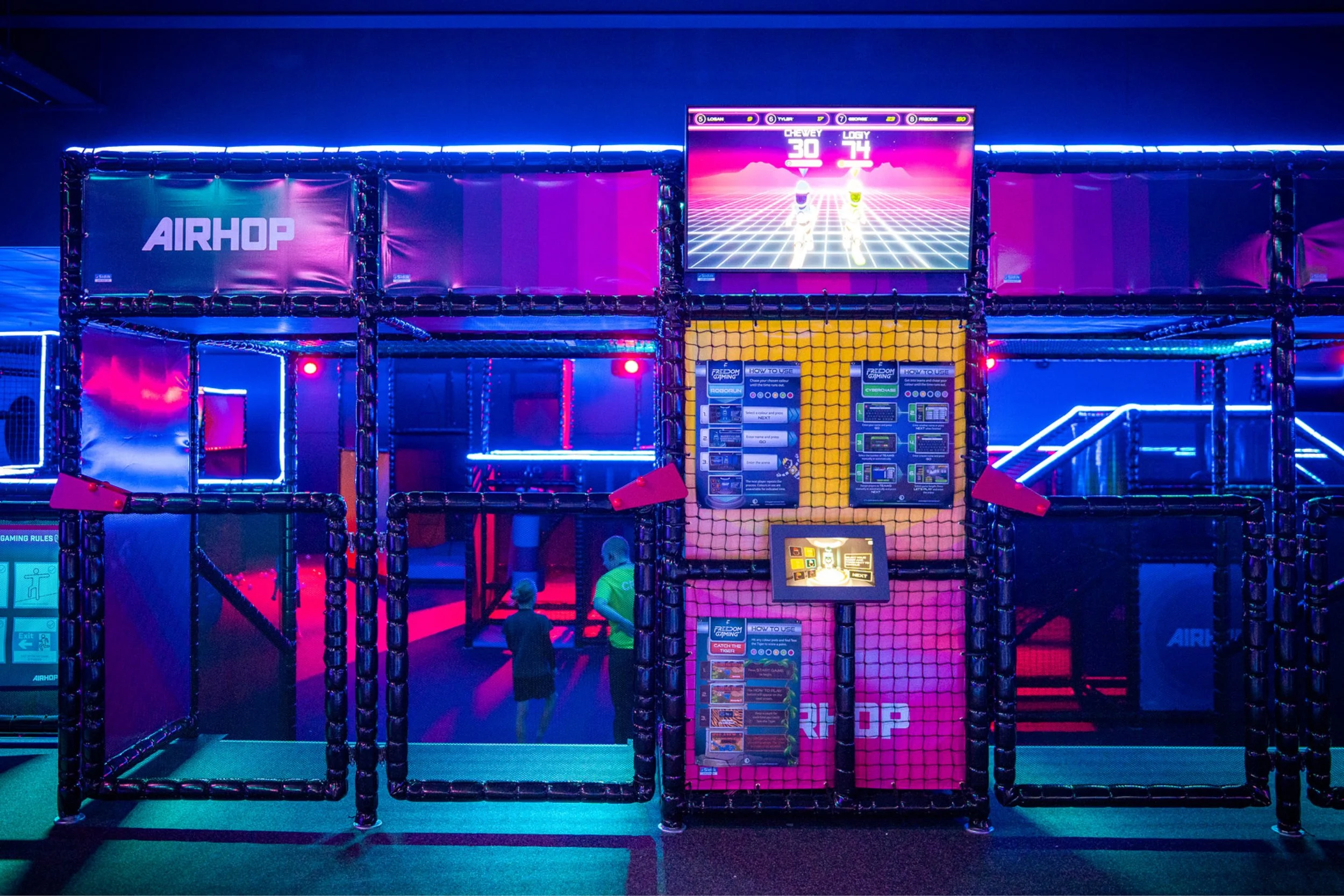
AirHop is where families come to bounce, climb, slide and let off steam. Trampolines are just the start. Think dodgeball, battle beams, obstacle courses and airslides.
After a period of fast growth, including bringing several other park brands under one roof, AirHop now runs 27 parks across the UK, with more on the way.
The challenge
The old brand had bounced its last bounce.
Created more than six years ago, it had become dated and patchy. With so many newly joined parks, it felt inconsistent to visitors and unclear to the teams running them.
AirHop wanted to become the UK’s number one adventure park brand. To get there, it needed one brand that pulled the business together and stood out in a busy market.
Our approach
We started by listening. Working with AirHop’s marketing team and directors, we looked at their audience, their competitors and their goals. We also surveyed families directly to find out what they loved, what they wanted more of and how the brand made them feel.
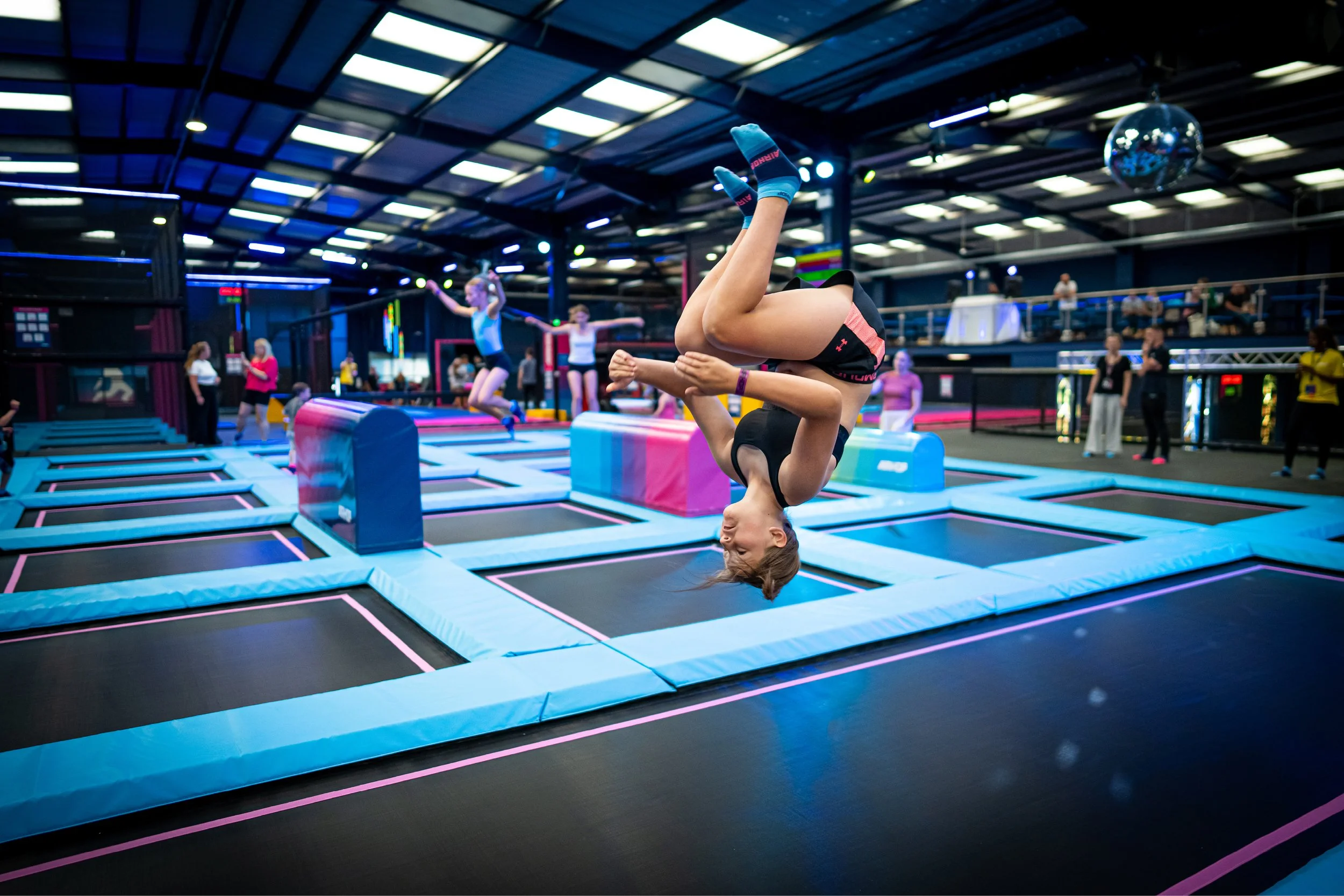
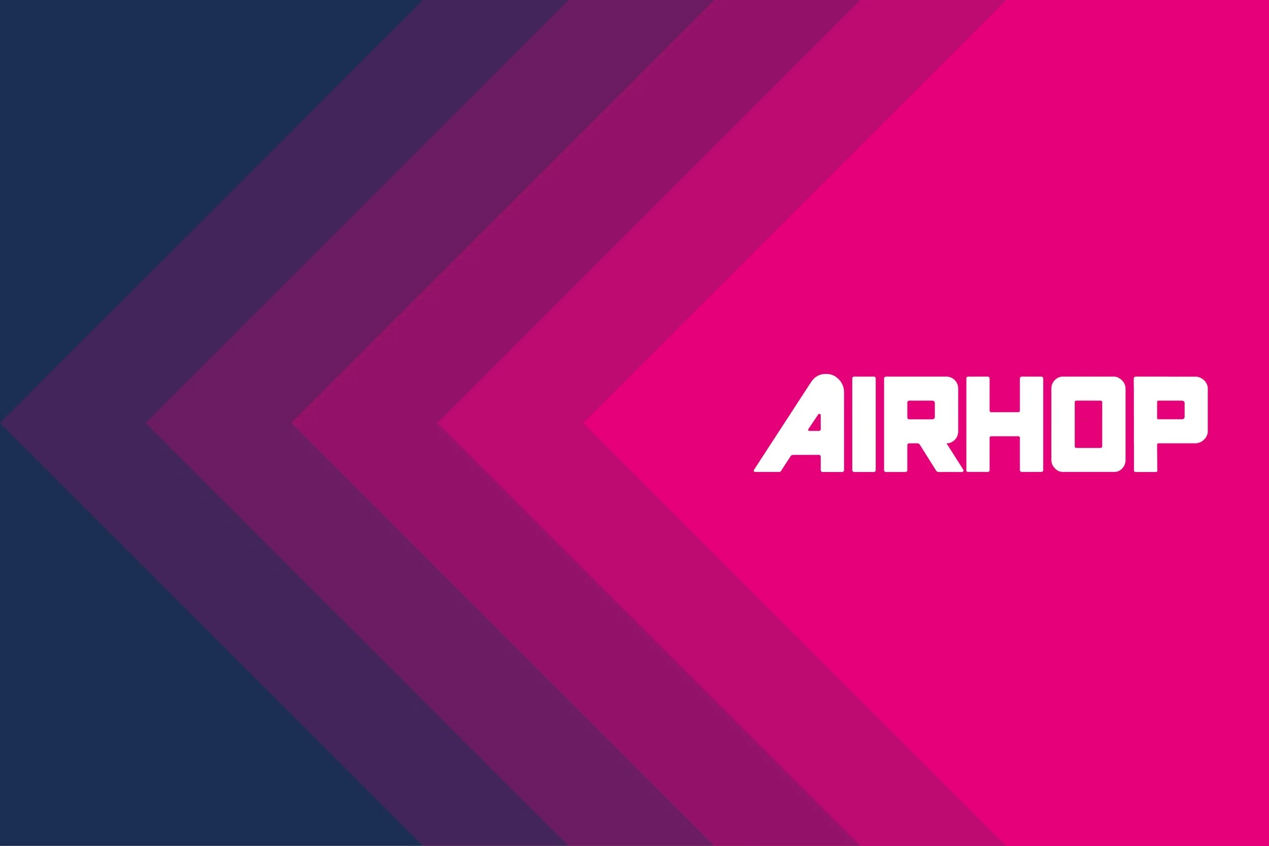
From there, we explored several ideas, each rooted in movement, energy and emotion. The one that stuck was The Pulse: the beat of excitement before a birthday party, the rush mid-jump and the buzz you carry home afterwards.




What we delivered
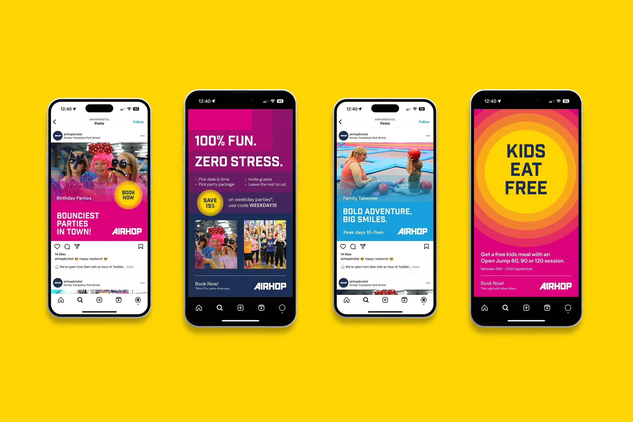
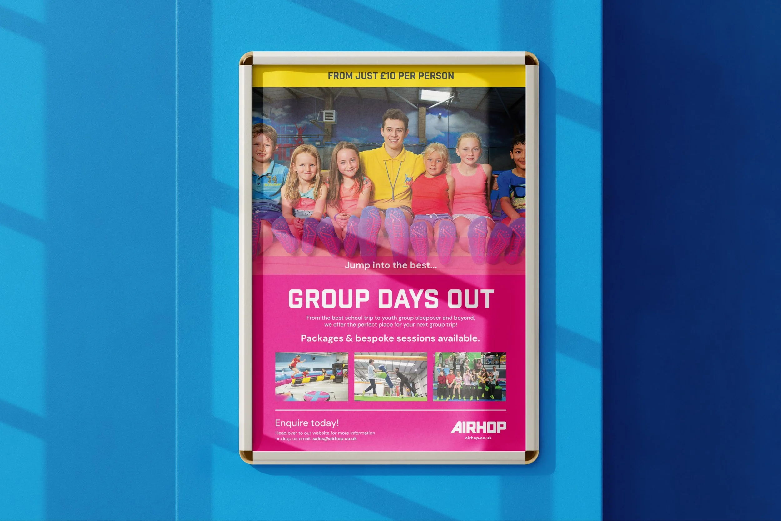
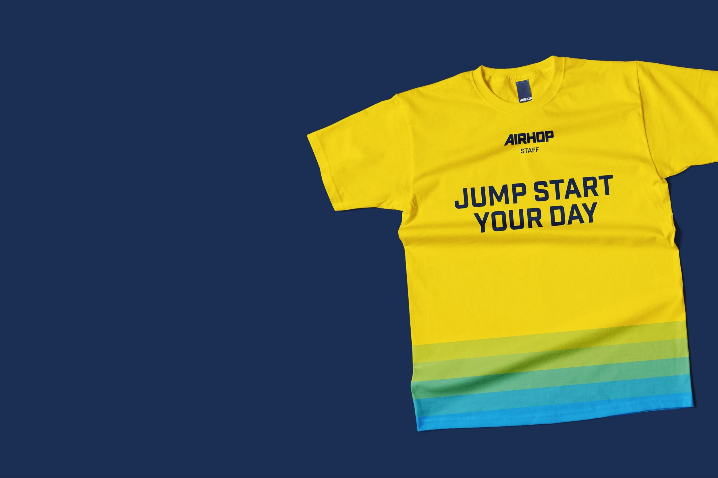
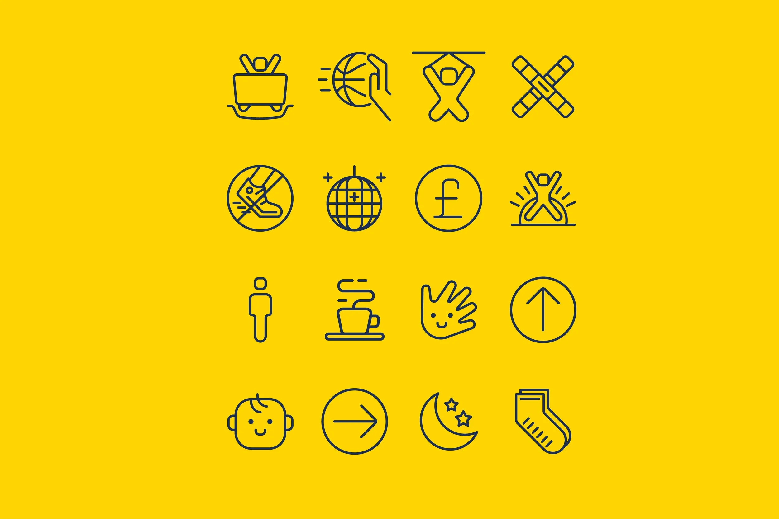
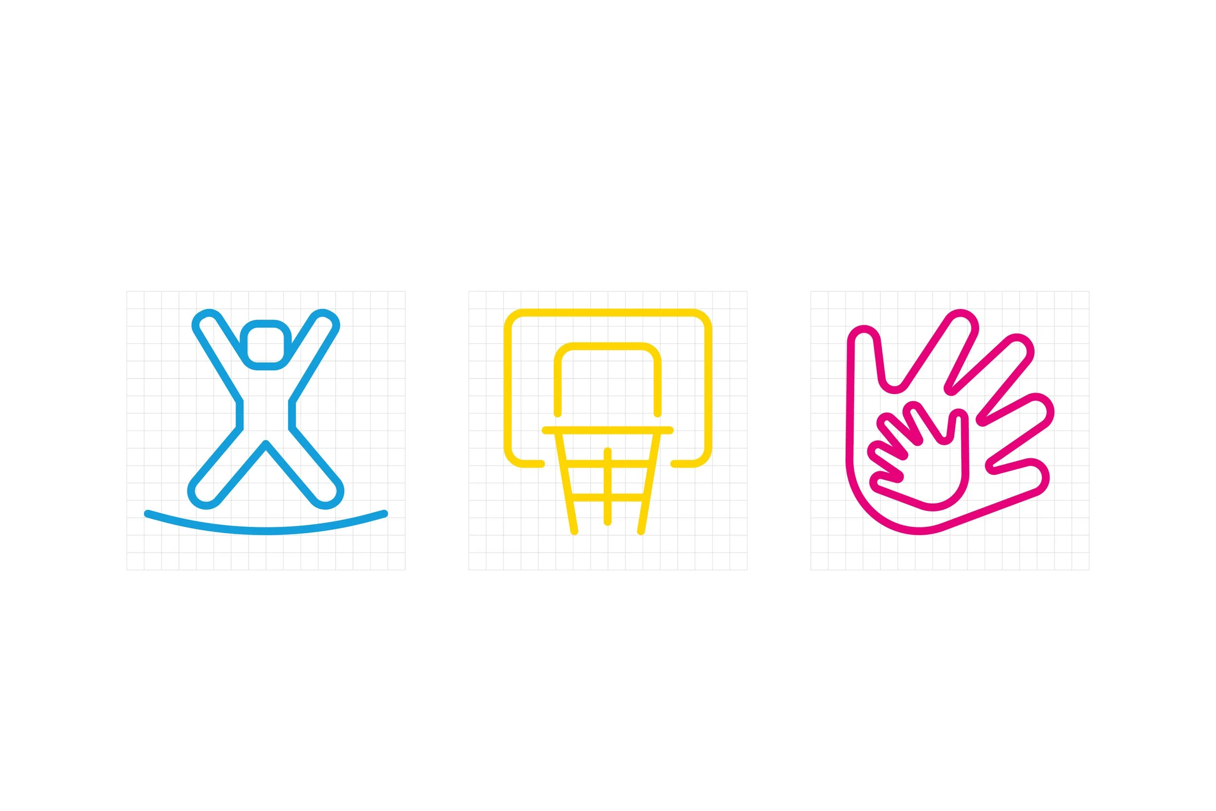
A new visual identity: logo, colour, type and icons
A flexible toolkit that works in the parks and online
Brand guidelines covering tone of voice and how to use the brand
Ready-to-use templates for the in-house team
The result
One clear, modern brand across all 27 parks
A brand built to grow as new parks open
An in-house team that can create on-brand work quickly, without waiting on a designer
What AirHop said
“Working with Charley and Gio at Rodolfi&Hall has been transformative for our business. They led the refresh of the AirHop brand with creativity, strategic insight, and a deep understanding of our audience. The new ‘Pulse’ brand concept has injected fresh energy into our parks and unified our identity across all locations. It’s bold, modern, and perfectly captures the spirit of active fun we aim to deliver. A true brand partner from start to finish.”
Sandra Zerr, Head of Marketing, AirHop
Ready to make the leap?
Tell us about your place over a coffee, in Bristol or via video call.
You may also like

FilmBath A retro campaign that brought audiences back to Bath’s film festival.
Service: Campaign / Sector: Destination

Forest Live A campaign that brings music lovers back to the forest every summer.
Service: Campaign / Sector: Destination